The New Autonomics Poster
Gathering Feedback
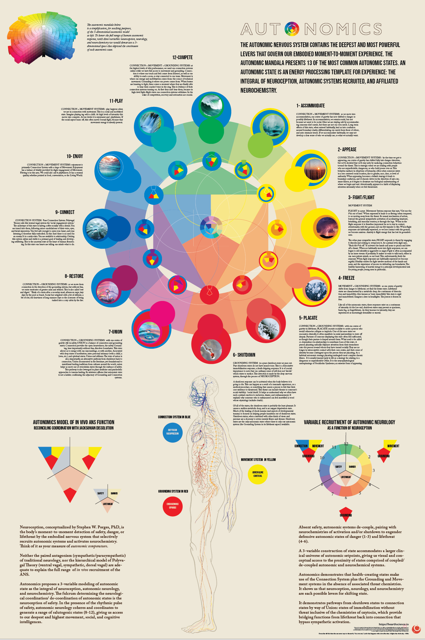
Here is the new poster.
We would appreciate your feedback. The poster is 24 x 36, and comes with a downloadable PDF of our new whitepaper: Towards an Accurate In Vivo Reconceptualizing of Autonomic State.
We will likely continue to iterate on the details for awhile, but want to get it into the world so that it can be useful.*
*I realize that the smallest script on the 13 states in the image above is not legible. For better or for worse, if we were to publish a super-high resolution image of the poster, people would just lift it off the internet. The image above is 60 ppi. The poster itself prints at 300 ppi.


How can anyone evaluate this without being able to read the small print?
Overall, I like it. I do have some questions that the poster itself doesn't seem to answer.
1) what is the vertical axis in the 3D model in the upper left? It seems that the compass is mapping a horizontal plane through the (center of the) 3D model.
2) I'm not at all sure what the small figure at the center is about - the colors used, their positioning, the curved lines between the central figure and inner circle of (geometric) figures.
3) I find the orientation of the inner circle of figures confusing. Is there some reason they're not all oriented with grounding down, motion upper right, connection upper left? It would mean the differently colored bit in the perimeter of each of these figures, rather than pointing up, would point to its o'clock position (I think). That seems more natural to me, though I may be missing something.
---
The titles/subtitles of the lower left and right figures may be fine for doctors. I don't get much of anything from "Reconciling Coordination with Jacksonian Dissolution." And if I understand "Variable Recruitment" it's modeled graphically in both left and right figures, unlabeled on the left, labeled on the right.